Tuesday, 13 November 2012

Week 2 Sampson

Week 2-

Tuesday we wanted to focus on the naming of our game, i wanted a name like Nigeria or The Order but Ben and Michael wanted Discord as the games name, me and sanjay did not like this as we thought it was not good enough and so Michael came up with the name Era Of The Damned and we all agreed upon this name.
After this i thourght it would be good to research some other creatures that we would want in our game such as Rats and Wolves. 

Wednesday me and Sanjay wanted to create the map four our open world game, we looked at maps from Fallout and Fable and then we decided to make our own but me and sanjay thought it would be best if we created a seperate map each and then let ben and michael decide what map they wanted, they had chosen to use sanjays map for our game world.

Thursday we decided to do our race research, i knew that i wanted to do the Dwarves race the Vampires and also the Elemental Races, this was all simple at first all i needed to do was create a look for each race and then have diferent skills and specification for each race.

Dwarfs- Sampson has started to research dwarfs, for this he looked at how some movies and games portrayed dwarfs and also looked at real life dwarfism and Sampson wanted to make the dwarfs in game as realistic as possible so Sampson thought dwarfs in game wouldn’t be able to hold as much as the other classes and so forth.

 
Elementals- This race was a specific race it isnt included as a clan but as a kind of partner, you could use elementals to help you fight and guide you withing our game and i wanted each elemental to look diferent and i wanted them to be easily recognised as the element they represent, my fire elemental was a fire monster wind was tornado monster and so forth.


Sunday, 11 November 2012

Michael Week 5 update


This week I started by making a basic look for our game case to be the front cover for our presentation I used the typographies that we wanted to use so I entered the name of our game into Photoshop then outline the letters separately and used a blood red colour for the main colour and used a dark red and ice blue as a highlight colours, for the last word I only did it in ice blue to make it stand out to give it a misty look I used the smudge tool to mess the words up.
On Wednesday we made sure that the blog was up to date and that we all knew what we were going to say in the presentation the next day
On Thursday we all will present our game idea to Simon, Drew and the group

sanjay week 5

Week 5 is last week before my team have to present it to the rest of the class in it's finished form. Secondly I started drawing my other setting which is the swamp area of the world where the levathin race inhabit. The swamp is teeming with poisonous life and the unknown.
I also wanted it to be hard to see bacuase of all the fumes that would be released from the swamp making it hard to navigate and to also keep the player on their toes from a superise attack by an enemy.
I also made a concept art for the air elemental and I wanted to show that she was made of air but also giving her a human nature. Also by giving her clothes to wear makes her more relateble than just some spireing air.
The last mysterious design I drew was for the last boss and what I wanted to show with this design is that because he is a shape shifter I wanted to show his original form. I also wanted him to look intimidating to the player and that's why I got some inspiration from death itself. The reason I wanted him to be imtimidating and mysterious to the player was because they wouldn't see this enemy ever again and I wanted it to be one of the best moments they would remember when thinking about this game. Lastly the players wouldn't have expected this and it would catch them off gaured making this moment even greater making it a scene to remember.

Michael Week 4 update


This week I started by writing up the storyline for the design document and the presentation as well as organizing the design document so the contents flowed and didn’t have any misspelling and errors.

On Wednesday we got together as a group and came up with different NPC characters for the player to interact with and the leaders of the different races and how the player can interact with them.

On Thursday we all started to added the different word documents we had to the design document and checked the lay out for the document to see if everything was in place then we started to talk about who would read what part.

sanjay week 4

Lastly I had drawn a concept of the cover art and what it showed was the game map on top a old oak table where a bloody dagger is piercing the centre of the map spelling the title (Era of the Damned).

Why I liked this cover art is because it tells the player what they are getting into, firstly lets talk about the flag at the top which shows the main factions in the game and if the player didn't know what those symbols ment they would once thay started playing.

Secondly you can see the map of the game world and in the final peice of this art cover the dagger will be peircing the map while blood will be ozzing out. Why I wanted it to be like this was to give it a symbolic meaning  and what that means is that the whole land has bled because of conflict and war.

Lastly there is the title (Era of the Damned) which has a deeper meaning then what you first thought and what players might think but it all comes together when you finish the game because it is about a hidden race that has been manipluting everyone for there own uses and which are called by their nickname the DAMNED.


Michael week 3 update


This week we started to make our own races for the game that the player could choose from that would be along with humans, elves and dwarfs. The race I choose was trolls since they are in many different fantasy type games so I researched different games that used trolls as a race in their games most were monsters that the player kills and were not the design I was looking for, then I looked up world of Warcraft game to use as my main influence of my design, I then looked up how they moved around and the way they acted.
After that I stared to look into the NPC race I was asked to design so I started to look up leprechauns for an idea since we wanted a race that would be a criminal race that ruled the underworld of the game that was neutral to the other races and since leprechauns are said to have a pot of gold and hide it from everyone I thought that it would be a good concept
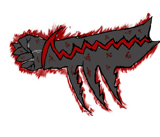
On Wednesday I started to make the gauntlet design that would be the players ‘pit-boy’ of this world. The gauntlet on left is the basic design which the player would wear at the beginning of the game which will evolve along with the player the more the player is good or evil the gauntlet will change with them till its max good or max evil (design on the right).


On Thursday I made the designs for the troll and leprechauns. For the trolls I used the idea of the world of warcraft trolls in the way they walked in a crouched position as they lived in the woods and were hunters, also I made them have long fangs that stuck out from their mouths with dark coloured skin so they could hide in the shadows better. As for the leprechauns I made them look a lot like humans but they were the same height of dwarfs. Since I made them a more businesses/criminal race I made them have a smart look about them in suits and smart looking clothes to show a classic gangster/mobster look.

Sanjay Week 3

On the third week our team split up to do different jobs on the project so I continued with my character design. I had drawn the eleven race that you can choose from the start of the game.
The reason why I made the elves race rugged was because thay are a race in the game that lives in the forests that are infested with dangerous oversized bugs and creatures so I wanted there enviroment to reflect on them and to show the player that the elves have been through a lot before the player meets them.

Later I started on the design document firstly writing the game ideas which explains what the game is about and what can get you up on the basics of what our game is.

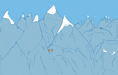
Lastly I designd the settings of the game and I started on the blue mountains which was in the most north of the game world. The mountains are a harsh environment where only blizzards dwell and where only the strongest survive which is why I put the race I designed to live there which as you know by now are the draugs. The reason I called the mountaines the 'blue mountains' is because the mountains are actually blue and this is  because they are so high and cold that the mountains have frozen causing them to look blue.


Wednesday, 7 November 2012

ben week 5

week 5 mood bored which we used for a last inspiration on the final push these involved melle and range including glass hammers axe and crossbows  bow and arrows fantasy weapons mixed with traditional med evil weaponry to give us idea's about enemys
 
ranged weaponry

melee

ben week 3


this is a concept of a in game npc victoria who is a potential companion/romance

sprinkles is a npc potential companion

silver fang is a companion/romance character

sanjay week 2

On the first day of the second week we were told to write a case study on concept art which was supposed to include answers to what is concept art, why is it used? and so on but we were also told to include how concept art effects a game. By doing this research I now knew what I had to do for my own concept art. The first thing I had learnt was that to not make concept art look like the final repersention of what the game will look like when the game is finished but to be more creative with your work.

Wednesday was the day I actually started the blog that had to include our progress on our project. The way I was going to tackle the blog was to put it in a weekly format so when a week was done on the work I could easily publish it onto the blog.

Later we all came together as a group and talked about what style we would include into our game and many ideas were passed around, one idea the was mention was that the game could be cel shaded. If we chose for this cel shaded style which is used in the most recent zelda game we could make the game world and enimies more exagereted like in Skyrim but I wanted to seperate our game from Skyrim so the idea I said we should have is to make the game more realistic. The reason why chose this type of style was because by making the game more realistic in the sense of art style is that the game world would be more imersive to the player and that the player will be more connected to the game aswell as the characters because they look like creatures that could exist in the universe because of all the detail we could include because of the realistic design.

Also by making this art dirction chioce it wold seperate us from our competitors, the biggist being Skyrim that uses a bit of a cell shaded look which makes the game unrealistic and breaks the connection from the game to the player.

Thirdly and lastly we now had to show our game to the rest of the class so with the work we were able to produce we showed what our team had done. We also got feedback from our peers which was helpful to us and also to them.